Storyline 360 is here. It just got easier to make e-learning that’s responsive and mobile-friendly.
One of the best things about Storyline 360’s is that its responsiveness doesn’t impact on your content creation.
Develop good content. Publish professionally. Apply the right settings. Then, let your e-learners enjoy the flexibility. This doesn’t require much more from developers. Articulate have done the hard work, so users get it easy.
Of course, the software is still brand new. Lucky for you, Storyline test pilot Veronica B is here to explain her 4 favourite new aspects of Storyline 360’s responsiveness.
 1. Slide properties are more detailed
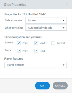
Developers have been able to turn the Prev and Next buttons on or off in the Player since Storyline 2. Storyline 360 takes this a step further. Now, you can also tick on or off Swipe gestures to move forward and back.
In cases where you’re using custom buttons for navigation, swiping forward and back can still be enabled simply by ticking a box. Yep, swipe can work even if the default player’s Prev and Next buttons are disabled.
Verdict
Swipe gestures are warmly welcomed. More detailed slide properties means you can have your custom navigation cake and swipe it too. Did I mention learners can now also pinch zoom on their touchscreens?
2. Preview different device displays
Preview mode now includes the capability to see how your course would look on a Desktop computer, on a Tablet or on a Phone. For mobile devices, you can also preview how it will look in both landscape and portrait orientations.

Verdict
Who wants to publish and upload to a server every time you want to know how something will look on an iPad? Not me.
3. New mobile device display options
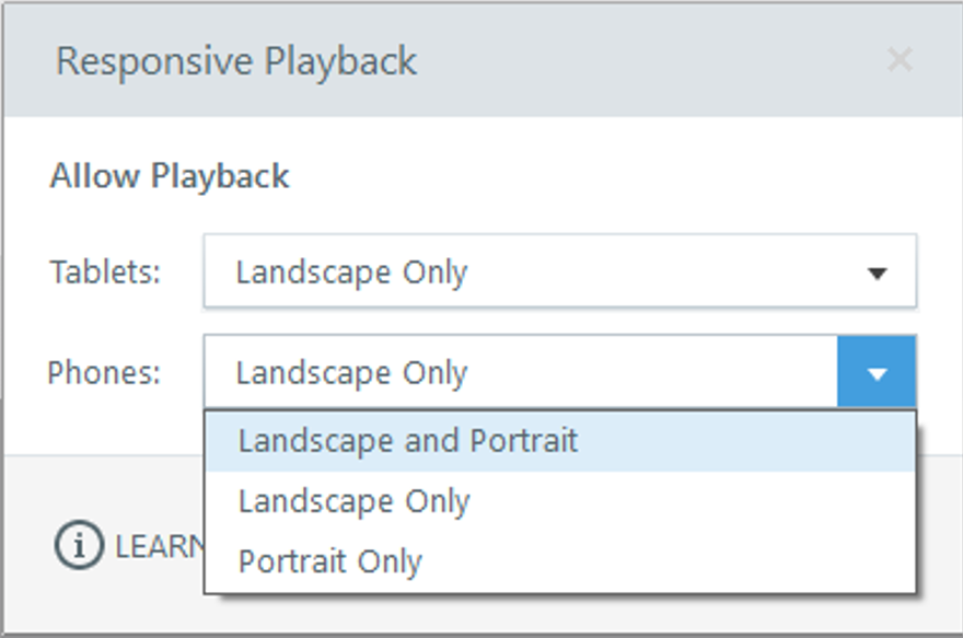
In the menu for previewing different device displays (pictured above), you’ll notice there’s a gears icon at the end. Clicking that open the following dialogue box: responsive playback options.

This extra little perk lets you set whether e-learners on mobile devices will be able to play your course in both landscape and portrait or restrict it to one or the other. You can even choose different settings for Tablets and Phones.
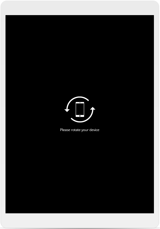
Users who try to view in a disallowed mobile orientation get the following advice:

Verdict
The ability to enforce a landscape or portrait orientation is good. The fact that you can do it with one click is awesome.
4. Responsive Player
Storyline 360’s new player is fully responsive. It’s true, I’ve tested it.
I’m not talking about the Articulate Mobile Player app for mobile devices. This is the functional framework that contains all browser-based Storyline courses. I’m talking about how users access basic navigation, tabs and stuff like volume controls.
Storyline 360 promises that you need only publish your course to a single file. Publish once and the player will adapt to look and work perfectly across all devices. From high-powered desktop computers through to 5-inch smart phones, all are well served.
With minimal need for developer tweaking, each e-learner gets an experience that’s customised for their hardware.
For touchscreens, common gestures work effortlessly, right out of the box. Standards like swipe and pinch zoom are automatically in effect.
Verdict
Laypeople often underestimate its importance and complexity of responsiveness. A genuinely responsive player will be welcomed by all Storyline developers.
So far, Storyline 360’s responsive player stands up to our tests. It looks like the real thing.
That’s Veronica B’s Top 4 Storyline 360 responsiveness features
Storyline 360 delivers on its much anticipated promise of a responsive player. There’s also broad flexibility for publishing projects that suit your needs.
Do you like the new publishing features? Let us know in the comments below!
For Storyline Training at your organisation, get in touch. Our experts have training solutions for both Storyline 2 and Storyline 360. Our tips and tricks engage everyone, from novices through to know-it-alls.